31Three.com Redesigned
This site has been looooong overdue for a redesign. I gave it a small refresh back in October of 2005, but the basic design has remained unchanged for the last three years. Three. Years. My business has changed a lot in that time, and my previous site just wasn’t keeping up.
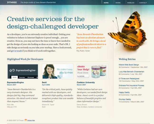
The largest change I’ve made with my business has been shifting my focus from web development to web design. As a result, the vast majority of my clients are now developers. In order to reflect those changes on my site, I’ve dropped all mention of logo, print, and full website work, and have instead given much more room to showcase my web designs. I’ve also tweaked the copy quite a bit to better target the market that I would like to work with.
I designed the work page on this site first, because I really felt it was the most important. Most of my clients will make their decision based on my previous work, so I wanted to showcase it as large as I could. This helped me decide early on to go with a wide layout. If my work was going to span the width of the page, that meant the navigation would have to run horizontally as well. Design elements tend to look better grouped in odd numbers rather than even, so I stacked the portfolio navigation 3 high, and 5 across. This gave me the basic column structure to work from on the rest of the site.
After I had the work page done, I moved onto the home page. I actually went into the design of this site with every intention of losing the butterfly. It’s been around since version 1 and I’m not quite sure why. It doesn’t have any real meaning or function other than just sitting there and looking nice. I had the home page pretty much complete and was trying all sorts of different things to fill the large gaping hole on the top right hand side… but nothing else was working. Butterfly 4, Jesse 0.
The weblog section got a decent overhaul as well. The text is much more legible and inviting, and the sidebar gives me much more room to showcase stuff like creative job listings, links of interest, and a “font of the month”.
Am I 100% happy with this design? No. Will I ever be 100% happy with one of my own designs? Probably not. But I’m learning that progress is a much better goal than perfection. Especially when playing the role of designer and client.
There are still many tweaks and refinements to come. I prematurely launched the site today before checking it in IE, and well… you know the story. Many thanks to Drew Warkentin for helping me squash some of those nasty bugs.