Kinoma redesign process
A few months ago I had the pleasure to work with the folks at Kinoma on a redesign of their website. The images below are a behind the scenes look at how the design progressed through a few iterations.

I first tried to capture the idea of showing different forms of content “flowing” through the phone’s screen…
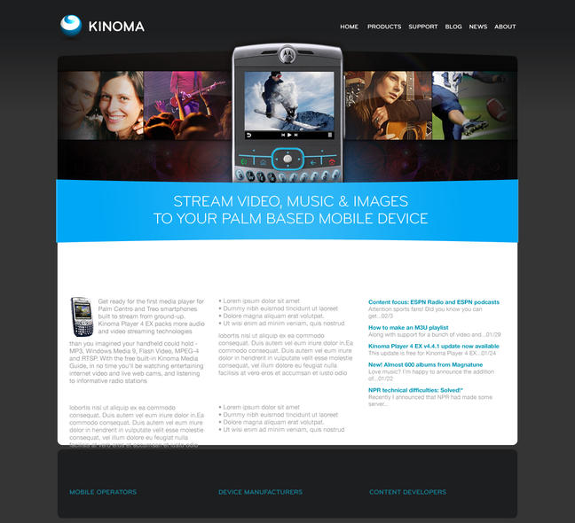
I felt the design needed a bit more contrast, so I added the blue band, and white content area.
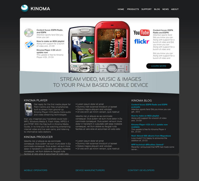
Although I liked the concept of the content flowing through the phone, it was looking a little flat to me. On this one I started to go down a slightly different path to see what else I could come up with.
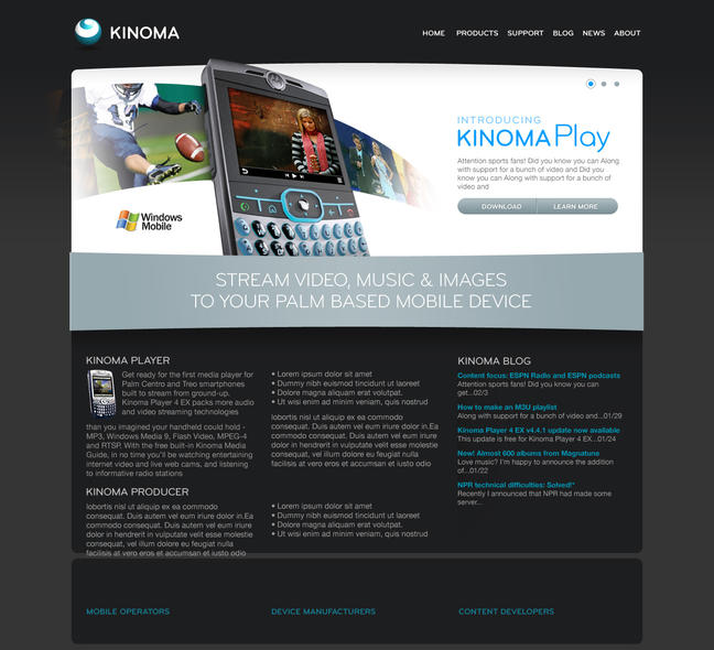
Kinoma really liked the first direction, and suggested I explore it a bit further. This led to the idea of taking the first image and adding an extra element of dimension to it.
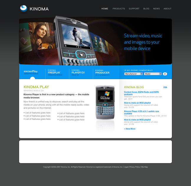
Kinoma really liked this idea, and the rest of the iterations were just fleshing out the content, and tweaking the background colours.
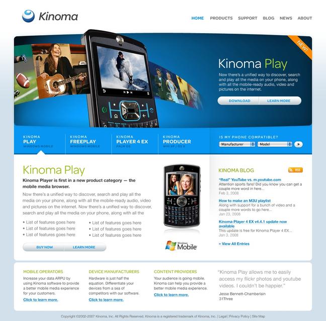
Overall I’m very pleased with how the design on this one turned out. I’m also pretty happy that I was able to sneak in a photo of my daughter Sadie into the last frame of photos.