Minor iCal Fix
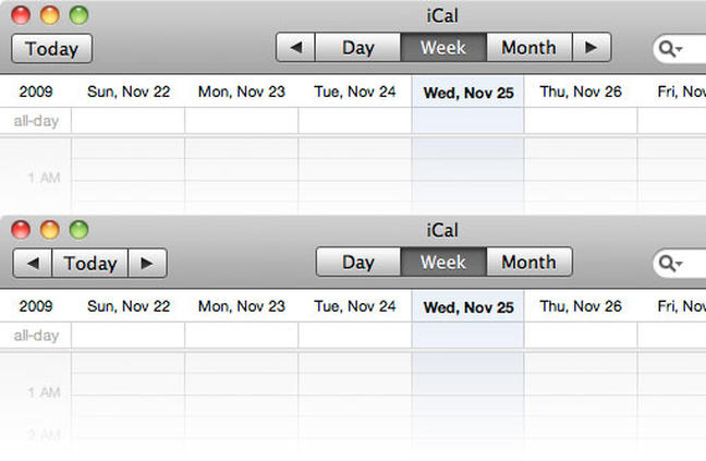
I was just using iCal and wondered if the interface wouldn't make a lot more sense with just one minor tweak. The toolbar on the top is how it currently looks, and the one on the bottom is my modified version. Currently, the monthly navigation is for some reason tied to the display options, and the "today" button is left sitting alone by itself. Wouldn't it make more sense to group all the navigation elements together? Just my 2 cents.

Nov 26, 2009
Articles