Campaign Monitor Landing Pages
When Dave Greiner from Campaign Monitor contacted me a couple months ago to see if I had enough time to take on some landing page designs for him, I was already fully immersed in another project and just wasn’t able to do it. I let Dave know that I didn’t have the time, but that I was really wanting to work with Brad Haynes on a project, and that I thought this one would be a good fit. Dave agreed.
Brad is a Art Director at Paramore|Redd as well as the principal of Anderbose and for today, he’s also a guest blogger at 31Three. I’m really happy with the work that he was able to do on these landing pages, and have asked him to share a little bit about the process. Over to Brad… - Jesse
Low-hanging fruit
I think it’s every designer’s dream to open up your inbox to find a request for a redesign on a project that looks several years out-of-date. So I guess I felt something quite different when the opportunity came around to design some landing pages for the beautifully redesigned Campaign Monitor. I knew it would be a challenge to meet, much less exceed, the high standards that Jesse set when redesigning the new site.
Focus 1: Markup, resell and profit
When designing landing pages, it’s great to be able to sum up everything in a few points. So it seemed great to me that there are three big callouts here: Rebrand. Resell. Profit.
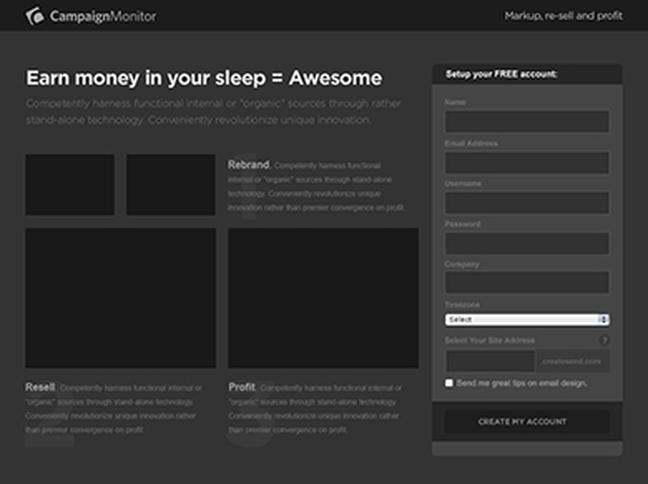
After applying the design elements to the wireframe, the layout quickly became too busy. In the wireframe, the flow is more obvious. But in the design, the numbers are removed and colors are added which allowed the feature area to become confusing.
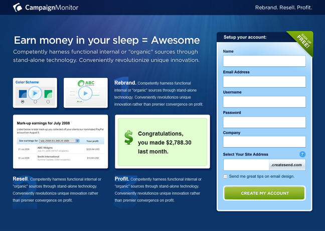
We decided to take a more linear approach to the feature well.
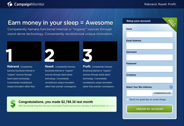
It felt better, but the feature area still needed to be simplified. We removed the 3 images above each step and replaced them with icons. This really cleaned up content quite a bit.
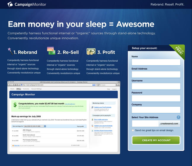
The next problem was that our callout copy was now touching the header text. Too much text together created some confusion, so we moved the big image between the header and the callouts. This, along with some color tweaks and spacing, led us to the final design.
Focus 2: Email marketing just for designers
The second landing page is focused specifically on designers, so we wanted to do something completely different from the existing brand. This approach is intended to build curiosity and hopefully is intriguing enough to warrant digging a little deeper.
In addition to the unique design, Dave wanted to try something a little risky on this one. By presenting the user with a modal window asking the question, “Are You a Designer?”, we are essentially communicating Campaign Monitor’s complete focus on the design community.
This design comes out relatively quickly, with slight iterations on the initial concept until the final was complete.
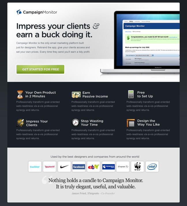
We really wanted to go with that fresh, slick Apple-like approach to the design.

The modal window incorporates large typography and resides on a slightly transparent background.
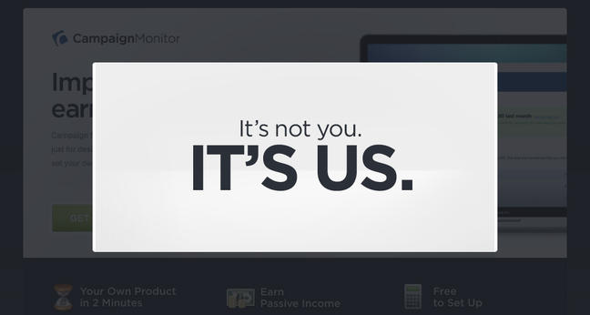
When answering “Nope,” you are sent off to the competition. A gamble to be sure, but as Robert Frost once said, “I took the one less traveled by, And that has made all the difference.” And, in fact, it did make all the difference. This version with the modal ended up having the highest conversion rate at around 4.5%.
Conclusion
All in all this was an excellent study in the landing page best practices. When conversion is the name of the game and you have so much you would like to communicate, it really comes down to achieving a simple, yet strong concept that is clear enough to understand immediately. You also have to be obsessive about creating a clear path to the call to action, removing unnecessary elements, and staying as focused as possible. Each piece should be doing its share of the selling.
So how did all this turn out? Well, because of Campaign Monitor’s business model, the true ROI will be a work-in-progress. But Dave just posted some really interesting details on the Campaign Monitor blog covering which banners (designed by Newism) and landing pages performed best, and which ad networks achieved the highest conversions. You can read about it here

